IG Group. IG Group.
IG Group. IG Group.
Case Study
How I helped IG reclaim its title as the global leader in retail trading.
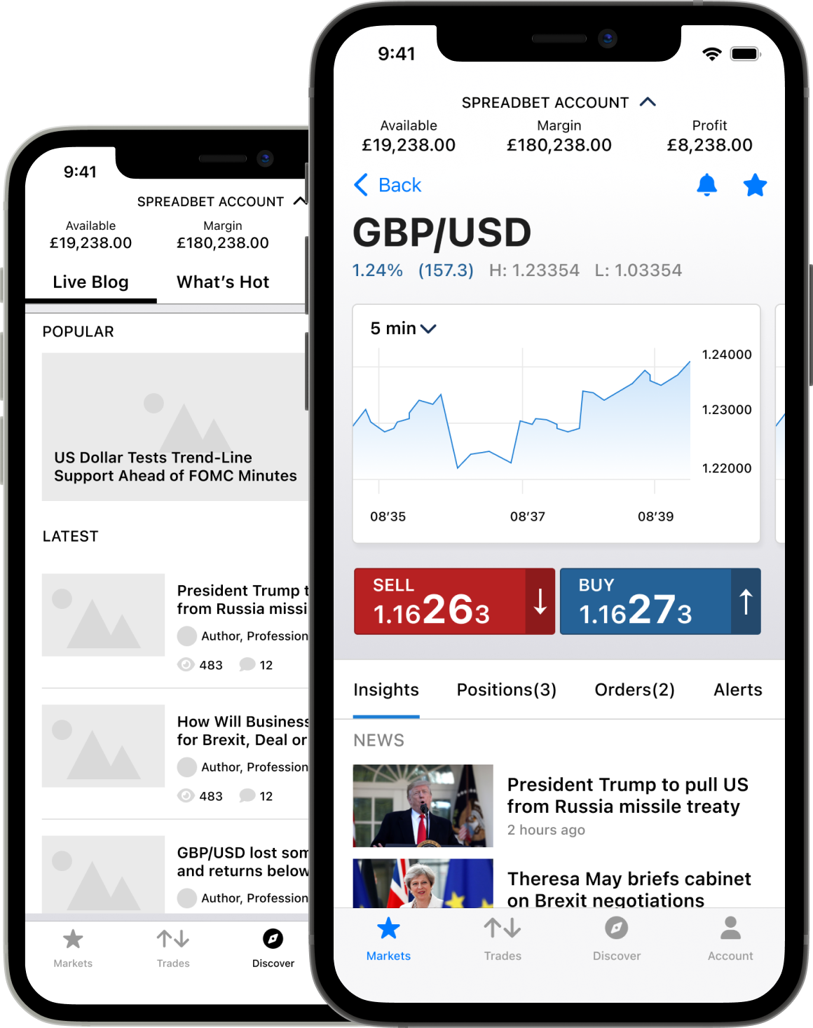
- Leading design teams across UK and Poland
- UX design for iOS and Android
- Interactive prototyping in HTML & CSS
IG is an industry leader in retail trading and I was asked to develop a design vision and strategy for the evolution of their mobile trading platforms.
These efforts led to the discovery of valuable user insights, numerous user experience improvements, and a validated long-term design direction for the future development of all IG's mobile trading platforms.
5 years on, the bluprint we laid then has proven to be a great success.
Results
-
Reclaimed top spot for retail trading
By going back to basics and sweating the details over key user tasks, IG's trading app was found 'best in class' by the Investment Trends report within a year
-
Key user tasks made 2x more efficient
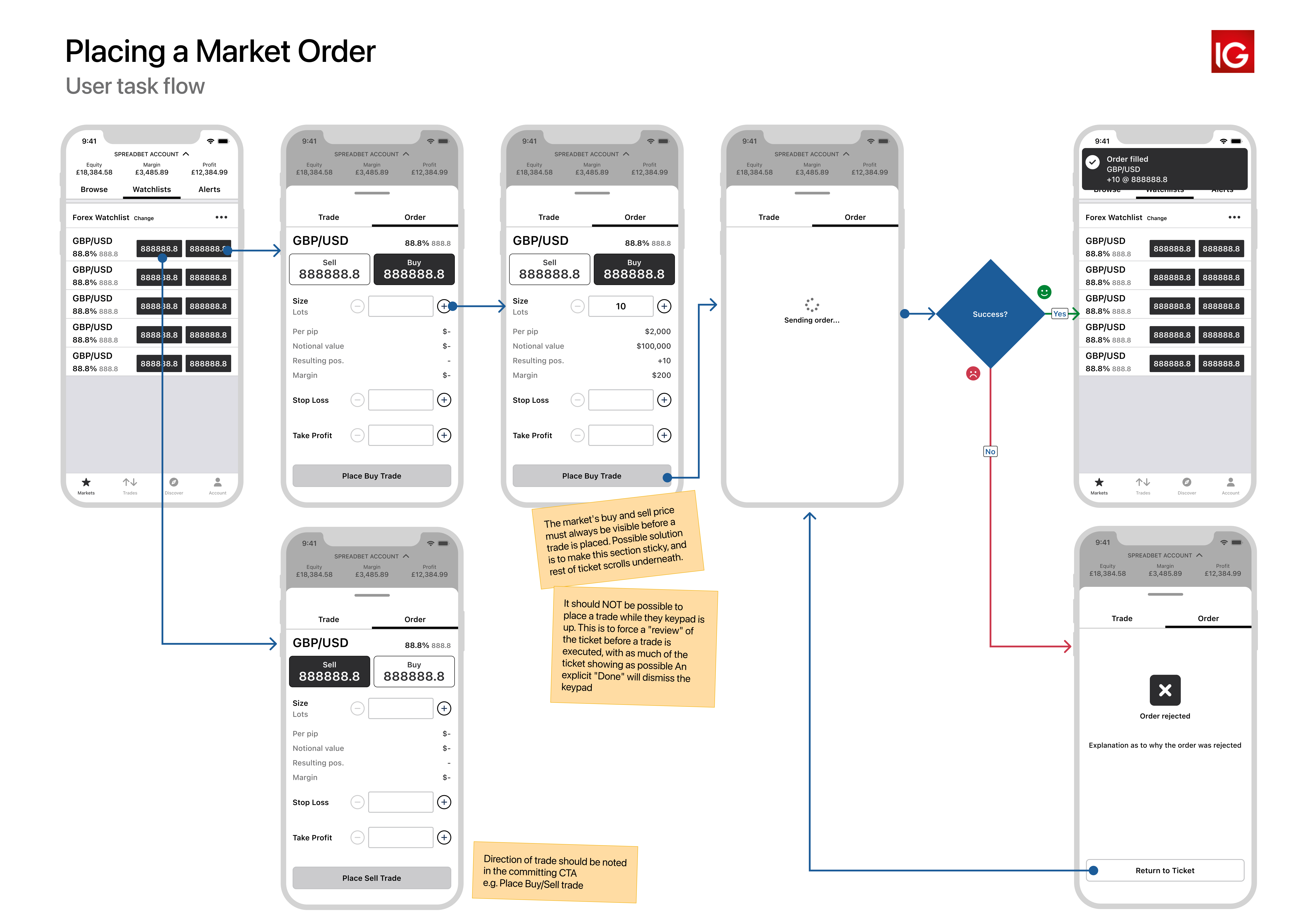
Key user tasks, such as placing a trade, were made up to 2 times more efficient thanks to the introduction of new interaction patterns and the addition of more supportive, less ambiguous information at key decision points.
-
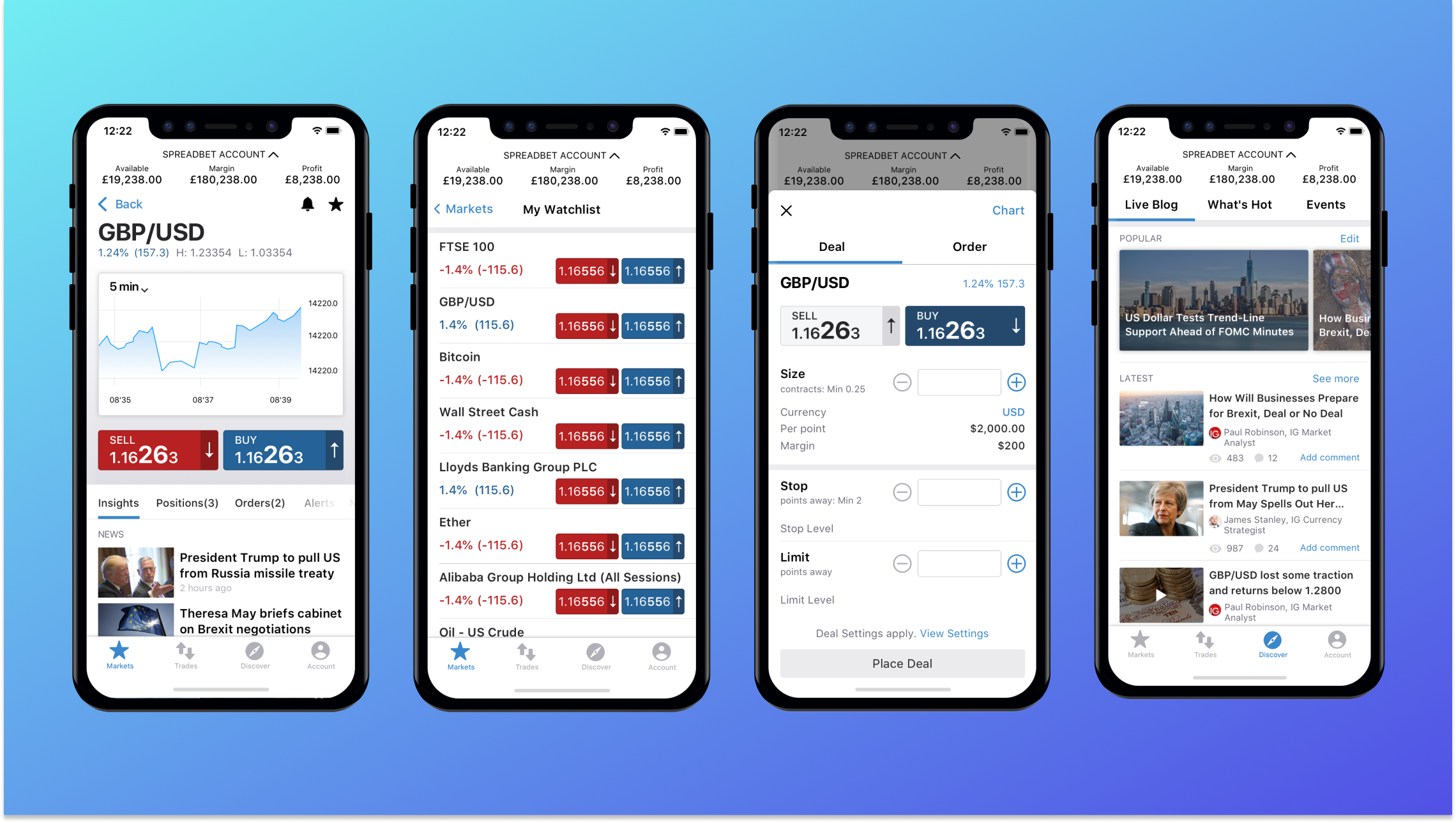
A revamped IA that became the default for all platforms
A revamped Information Architecture that tested so well with clients, it has become the template for all IG's trading platforms, including desktop.
-
Reduced future design and dev costs
The future cost of mobile design was decreased thanks to a cross-platform approach that's resulted in UX and UI that scales across platforms while respecting mobile OS idiosyncrasies.
What I did
- The Brief
- Benchmarking
- Laying Shared Foundations
- Initial Discovery
- Workshops to Build Shared Understanding
- Prototyping and Usability Testing
- Wrapping Things Up
The brief
The eagerly awaited 2015 annual Investment Trends Report had arrived. For the first time ever, IG's flagship app had slipped from the top spot... to third. IG had invested heavily in their apps the previous two years, making them by far the most feature-packed on the market, but this 'more is more' approach obviously wasn't resonating with clients.
With competition increasing and mobile trading becoming ever more important to clients, a serious strategic rethink was needed.
Unfortunately, due to the time-pressured nature of past improvements, the mobile apps had a crippling amount of tech-debt to unravel. This meant delivering any fundamental changes quickly to production, for customers to enjoy, would be impossible.
Objectives
- Identify why IG's apps are losing ground to competitors and better understand what traders are looking for in a mobile trading experience.
- Propose a validated set of forward-looking designs and prototypes that will inform how IG's trading apps should evolve over the next 18-24 months
- Align the mobile apps with the visual identity forged by the recently released desktop trading app, to aid a consistent multi-platform trading experience.
Benchmarking
The first task was to begin benchmarking the current design and user experience, so we'd have something to measure proposed improvements against.
To do this, I first carried out a thorough heuristic evaluation of the apps. The framework I hung my work on was David Travis' Red Route model, which defines a key task as one that's completed by all users, is high frequency, and is critical for both users and the business.
It's straight-forward, and I find it great for getting user-centric, and naturally more business-centric stakeholders positively engaged with the process. Which is half the battle in design.
Key findings
- Several key tasks were hindered by an inefficient feature-driven, rather than task driven, information architecture (IA). This meant valuable functionality that aided a common task were often inaccessible from one another.
- Creating an order, perhaps the most critical task in the app often required several stages of navigation, away from the information that triggered the trade decision.
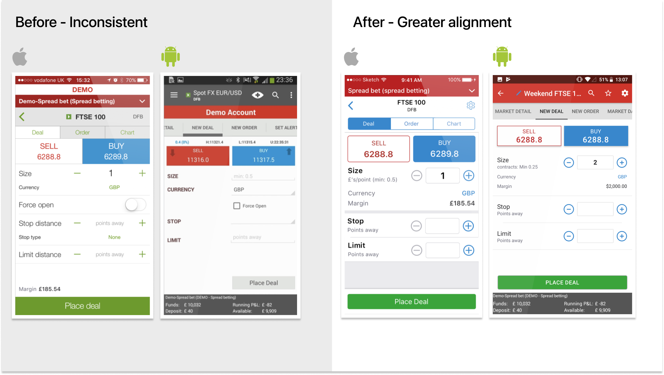
- iOS and Android looked and felt like they were built by different companies. Navigation, task-flows, UI and even labels were inconsistent. This, meant scaling optimal solutions for both would be impossible in the current state.
Laying Shared Foundations.
Always trying to find silver-linings, I thought I could take advantage of the tech-debt clean up by working with developers on a mobile design system, that would bring about greater consistency between iOS and Android, where it made sense.
Though this didn't address the major problems, as that would require more fundamental changes and a more robust research approach, this shared basis would help scaling later and it was work that could safely be done now.
Initial Discovery
With the initial evaluation complete, it was time to begin uncovering insights that would drive our design decisions.
The main questions I wanted to answer were:
- How do traders find trading opportunities? What sources do they use, which data points are most important and which tools do they love?
- How do traders go about creating orders? What factors are they weighing up, what informs trade sizes, how are they managing risk and what difficulties do they have translating strategy and intention to input?
- How do traders monitor their accounts when they've "skin in the game"? How frequently do they check, what tools do they use and what frustrations have they faced in the pursuit of maximising profits and minimising losses?
Qualitative methods
- User interviews, in which I spent up to 90 minutes with clients who frequently trade on mobile. This was a mixture of semi-structred interviews and having the clients demonstrate how they complete tasks currently.
- Watching usability testing of the recently launched desktop app. Though this didn't highlight mobile specific problems, it was very valuable in understanding how traders thought, where their priorities lay and their behaviours.
- Focus groups, as suggested by the research team. Despite the drawbacks of teasing insights from group-settings, focus groups aren't to be entirely dismissed if not used in isolation. They're useful primarily for identifying avenues of further research and a convenient opportunity to expose a team to clients in real time. So I helped the research team prepare this.
Quantitative analysis
In parallel, I spent a lot of time getting data from B.I. (Business Intelligence, a data analysis tool), Trading Services support emails and whatever analytics the mobile teams could give me. This uncovered some nuggets of info that informed new design directions, or entirely new avenues.

Once we'd sorted, categorised and analysed the data, we had a wealth of insights and research deliverables to work with. The outcomes included a set of trader personas/archetypes detailing characteristics to design for, and numerous hypotheses to begin exploring.
Workshops to Build Shared Understanding
If we are not only to "get the right design" but also "get the design right" when implemented, building shared understanding of the project's goals, user insights, and plan of action is essential.
I planned and facilitated workshops with the mobile development teams in both London (iOS) and Krakow (Android). I and the researchers shared all insights and conclusions from the research process, which generated great, in-depth discussions. The product team members could begin taking an informed and active role in the design process from then on. We then discussed the Red Routes and how we would collaborate on the next steps.
Insight. Involving the rest of the mobile product teams only once much of the research had already been conducted isn't my preferred way of working. Far from it, but despite the PO's understanding for whole team involvement, the prevailing project-management culture was against us. You have to pick your battles, and this was a compromise.
Prototyping and Usability Testing
With a good amount of research, and everyone on the same page, it was time to roll up our sleeves. The aim was to explore and validate the hypotheses formed in the initial discovery phase for all key tasks. We wanted to produce a good-quality, thorough prototype for Premium client testing, which would help uncover new insights and inform iterative improvements... or total rethinks.
The steps we took
- Map the problem We mapped out the key tasks and any interstitial steps we knew needed to be included. Often there were multiple possible start and end points, depending on the type of trader. For example, the way chartists identify opportunities and place trades is quite different from the flow a fundamental trader would follow.
- Collate relevant data, insights and hypotheses. We walked through each step of the problem and attached all the insights we had for that step.
- Sketch and review. We sketched out ideas and I began drafting them up into wire-flows. This work was frequently reviewed by design colleagues during design crits, and by trading services.
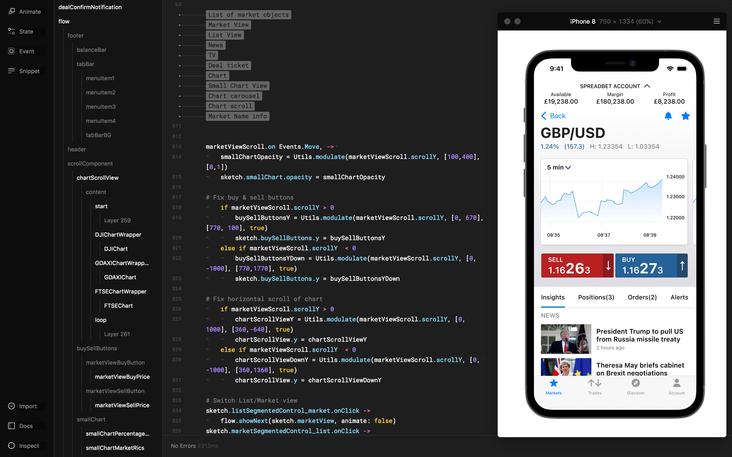
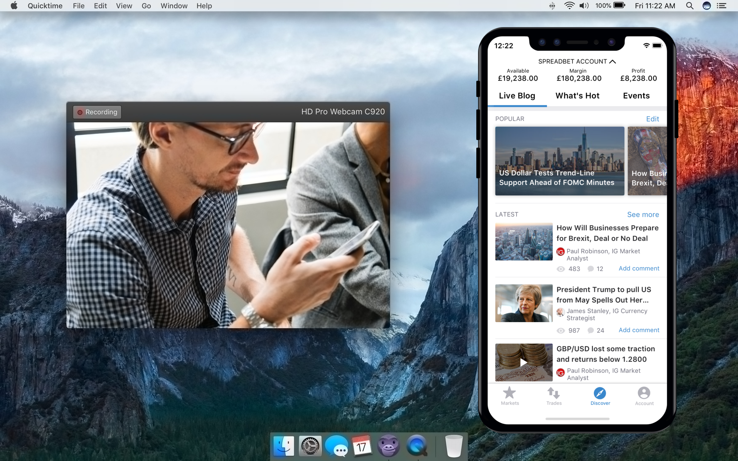
- Prototyping Together with the UI designer we took the wire-flows and went slightly higher fidelity in Framer. This allowed us to sense check the data and layouts in the wireframes, and ensure each responded well to different device sizes - including tablet. If these basic things break down, we catch them early. Once we were happy, we plumbed in some real data from IG's API which really tested the layout, as we got real market names and prices in place.
One major obstacle we had in this process was the same one shared by anyone designing in niche markets - access to clients for usability testing. This reality meant usability testing with real target clients was saved until we had explored all 3 sprints.
To help mitigate the issues that arise when you don't have the ability to frequently check assumptions, we turned to colleagues from around the business, particularly Trading Services team members.


Wrestling with a tough product challenge and need a lead designer with a proven track record?
Book a free intro call