This article is a work in progress. Hope to have it finished soon!
Our best banking apps fall short
Transaction lists are bloody important things.
They help us to keep track of our finances, recognise spending habits and troubleshoot balances that don't quite meet expectations.
Yet, for many banks, transaction list design seems an afterthought. Whether it be those well-known for their design such as Monzo, Starling and Revolut, or legacy banks who've been doing this stuff for over a century in many cases. All could do with some improvement.
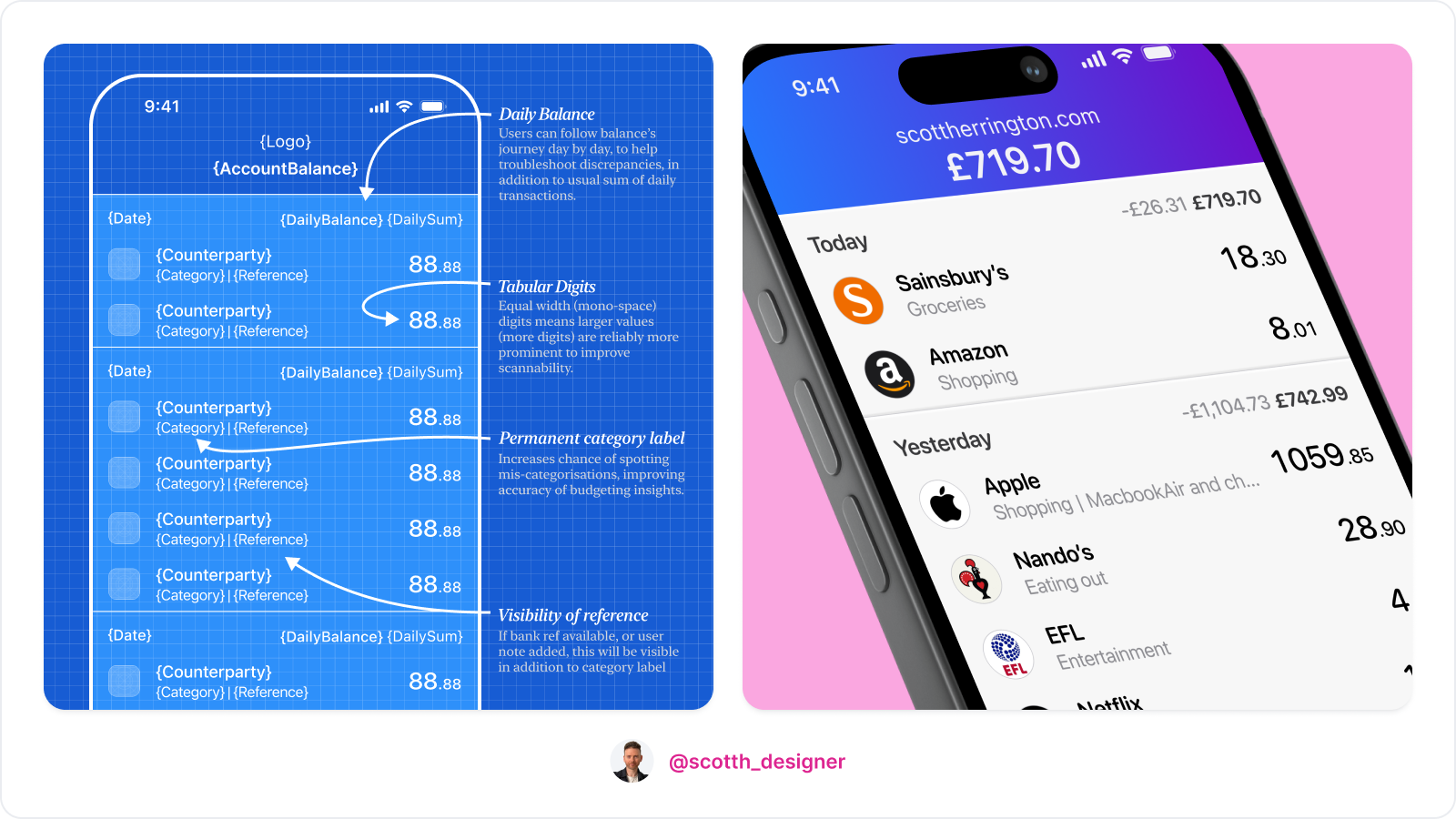
In this article, I'll dive into the UX of bank account transaction lists – highlighting the good, and the not-so-good, before presenting my own design which I hope to persuade you is objectively better than anything out there right now.
What problems/tasks do transaction lists solve for?
When designing, it's crucial to understand the user tasks we're aiming to support.
When it comes to banking app transaction lists, here are the tasks I believe need to be addressed, to build customer trust and deliver a great user experience:
- Easily spot suspect or noteworthy transactions. // Weighted amounts, reduced noise and tabular.
- Easily reassure myself that my account's balance is an accurate result of legitimate, intentional activity // Different states with bank refs and user notes or foreign currencies. Daily sum of transactions and balance.
- Gain accurate awareness of spending habits
- Categorise transactions accurately, so financial insights derived from them are accurate and useful. (for those banks providing budgeting functionality)
1. Easily spot suspect or noteworthy transactions.
Banking customers need to be able to scan their transactions list and easily find specific transactions or spot suspect ones. In the case of potentially fraudulent transactions, bigger amounts need to reliably stand out.
In both cases, scannability of transaction values and counter-party names is a top design priority.
When it comes to making counterparties stand out, many apps have adopted the common pattern providing a logo where available. This is a great way to aid find-ability while scanning.
When it comes to making amounts scannable however it's more of a mixed bag.

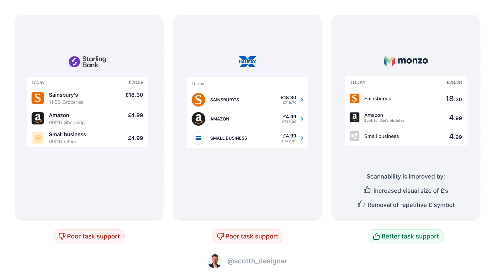
Monzo's design is by far the most considered. They do a couple notable things:
- Give greater visual weight to the pre-decimal integer digits that denote pounds, relative to the fractional digits denoting pennies.
- Omit the £ symbol for all transaction amounts, to help reduce noise.
Starling, Halifax and pretty much all others do very little to aid scannability of amounts. It just doesn't seem to have occurred to them. Denoting all amounts with the currency £ symbol is arguably overkill in the context of a single account transaction list, where there's little ambiguity over what the amounts are, and it does come at the cost of repetitive noise. Also, all digits are treated equally.
So Monzo deserve lots of praise for this one I think. But it's not a new finance design innovation. It's something that's common to the world of FX trading for example. Here's a design from my days at IG. When trading currencies, it's the pip movements that customers need to focus on. So we help them out, by making those stand out.
![[pips in forex.png]]
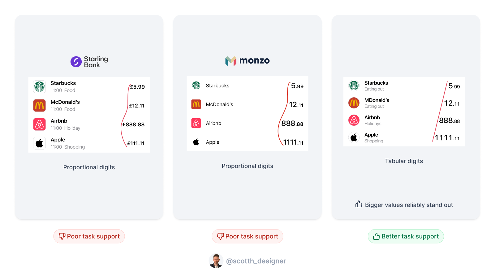
To my knowledge, no banking app does the one super simple thing that would make scanning transactions for amounts above a certain threshold reliably easy... use tabular digits.

Fortunately, most banking apps are pretty good at helping us spot business counterparties.
Different states for different types, because not all transactions are equal
Though all transaction share some details, such as counterparty, amount credited/debited and booking time, some transactions have additional info that's useful to customers. For example, foreign currency transactions will have the original amount included, as well as the amount debited in your home currency after exchange. Some transactions will have a useful bank reference etc.
Ideally, transactions lists should show the most useful information available for each transaction, to help customers identify it and reassure themselves all's correct.
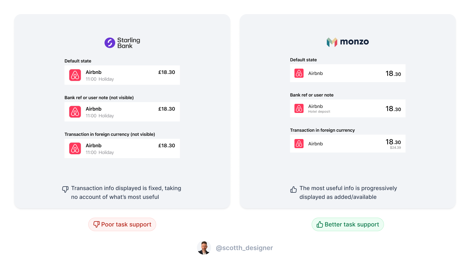
Honestly, Monzo do a great job of this. Starling... not so much. To help illustrate this, here's Monzo and Starling's transaction cell design side by side for different cell states:

Monzo's approach is "less is more, until it's not". When less isn't more, they just progressively disclose additional useful information as necessary. Lovely jubbly. The one thing I'd say about Monzo's design is that it's minimal to a fault in one specific case - transaction category visibility. Which we'll take a look at later.
IMAGE
Starling on the other hand obviously believe "consistency rules", treating all transactions the same. This makes for a visually balanced UI, but at the cost of UX. Users have to go digging into the details page for useful info such as bank ref.